The Nike swoosh, the bitten fruit of Apple and Mickey Mouse’s simple silhouette have been voted the best brand logos of all time, according to a new study by promotional experts.
Researchers polled the nation to discover the most iconic brands with The Nike swoosh – designed by Carolyn Davidson in 1971 – coming top (44 percent), followed by the ubiquitous Apple logo (34 percent), the brainchild of graphic designer Rob Janoff.
In third place was Mickey Mouse’s famous circular ears (21 percent), used by Disney for many of its subsidiaries, while the castle and Walt’s famed signature features on its movies.
Which other retail brand logos made the definitive list?
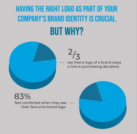
Amazon’s Arrow, Adidas’s striped flower, the Michelin Man, the four interlocking circles of German car maker Audi and the Google logo all made the list – as did Ikea’s yellow lettering, Coca-Cola’s swirly writing and the Starbucks “siren”. The data compiled by promotional products retailer 4imprint, discovered that these logos are viewed as important to people with 83 percent of more than 1,000 respondents saying that they’d even felt “comforted” when they saw a logo. And two thirds of us say that the logo of a brand plays a role in our purchasing decisions.
No surprise then that the research found a link between logos and favourite brands with the top two brand logos – Nike and Apple also triumphing in a list of favourite brands. Third on the list was Netflix with 36 percent of votes.
Why do customers choose to buy from these brands?
The research delved into our relationship with corporations with 77 percent saying they “trusted” certain brands and 83 percent saying they chose brands that they had heard of.
Four out of five people said they had recommended a brand they trusted to friends out of a sense of loyalty.
Price (57 percent) was the top reason for choosing a brand, followed by reliability (55 percent) and then value (49 percent).
Commenting on the research, a spokesperson from 4imprint, said: “Our results found brand logos are hugely important to many.”
“Having the right logo as part of your company’s brand identity is crucial – if you get your logo and brand identity right, it can have a huge impact on the success of your business.”
Interestingly, the research found that over half (51 percent) of people surveyed feel MORE connected to online brands such as Google and Twitter, compared to offline brands – with only 22 percent saying they felt less connected (and 26 percent saying they’re equally connected).
However, two thirds of respondents said that people do put too much trust in brands. And half of us have fallen out with a brand which we won’t use again.
What type of logos convey brand values the best?
When asked what type of logos people believe get over brand values best, Monogram logos like Volkwagen, Gucci or Louis Vuitton came top with 44 percent of the vote, followed by Wordmark logos such as VISA, Coca Cola, Google and NASA (41 percent) and Pictorial mark logos (or logo symbols) similarly to Apple’s, twitter and instagram came in third with 40 percent.
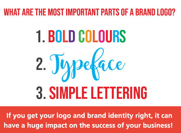
Findings published in a new report on the best brand logos by the leading promotional products retailer reveals that bold colours (51 percent) are seen as the most important part of a brand logo, followed by typeface (33 percent) and simple lettering (30 percent).
Sign of the times
Interestingly, young people aged 16 to 29 were FIVE times more likely to appreciate the Nike Swoosh than their over 60s counterparts, 58 percent of the younger generation picked it as a favourite compared to just 11 percent of the over 60s.
The over-60s were much less likely to rely on brands too, with only 45 percent saying they relied on certain corporations compared to the national average of 75 percent.
TOP 25 BRAND LOGOS
- Nike swoosh – 44%
- Apple’s apple bite – 34%
- Disney’s Mickey Mouse Silhouette – 21%
- Coca Cola’s swirly writing – 21%
- Amazon’s arrow – 18%
- Ferrari’s horse – 17%
- Mercedes three pointed star – 16%
- Audi’s four interlocking rings – 15%
- Jaguar’s Jaguar – 15%
- Adidas’s striped flower – 15%
- The Starbucks Siren – 14%
- Twitter’s Bird – 14%
- Google’s coloured logo – 14%
- British Airways’ Flying Flag – 11%
- Guinness’s harp – 10%
- Michelin’s Michelin Man – 9%
- Toblerone mountain – 9%
- Ikea’s blue and yellow lettering – 9%
- Facebook’s f – 8%
- Subway’s S with arrows – 8%
- Boots’s writing – 7%
- Ford’s blue writing – 5%
- BP’s green sun – 4%
- HSBC’s Red and white triangles – 4%
- Walls’s heart – 4%
