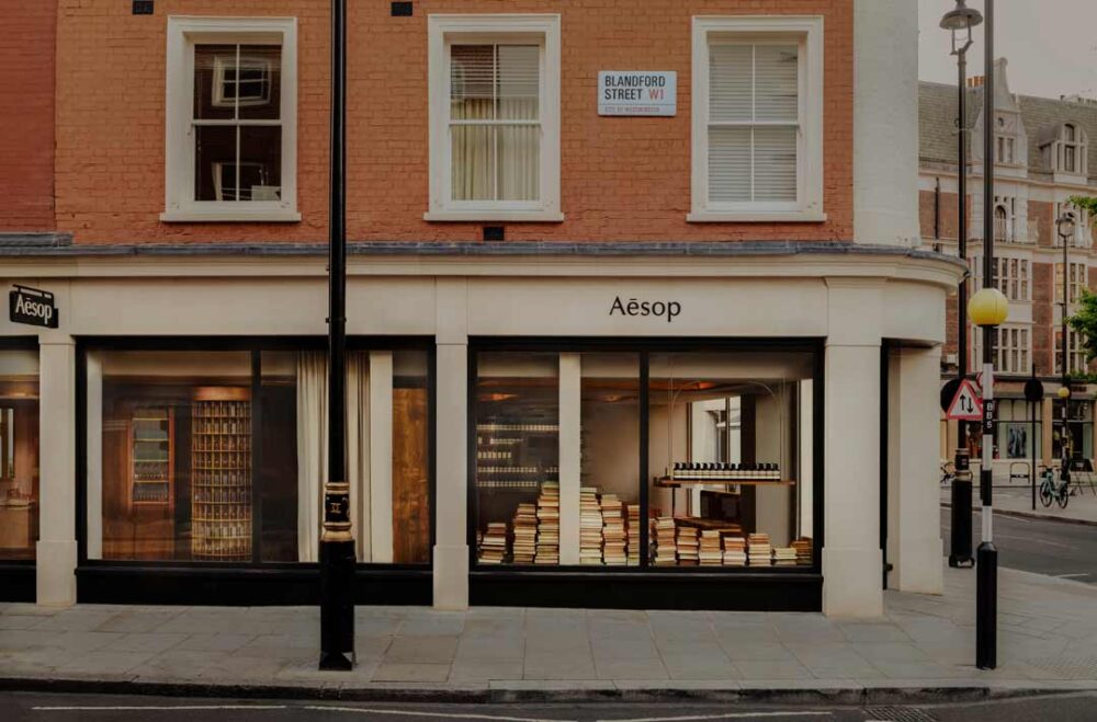
Following a ten-year tenure in its musk-tinged shop, Aesop has transitioned to a new, larger property on Marylebone High Street. The brand’s in-house design team has transformed this corner location into a tranquil sanctuary, with inspiration drawn from the peaceful gardens and stately architecture distinctive of the Central London neighbourhood of Marylebone.
The layout, following the intimate feel of neighbourhood bookshops, partitions the large, L-shaped property into two separate, cosy spaces, thereby instilling a sense of intrigue and discovery as one navigates through the store.

The first section of the property is characterised by its rhythmically arranged, limewashed oak shelves, their innate warmth amplified by a careful staining with linseed oil. All store cabinetry was custom-made by Sebastian Cox, a local London-based furniture maker. The ceiling features frescos by Olivier Cousy, which reflect Marylebone’s green squares and the muted colours of the British Library. The frescos’ color scheme—shades of forest, olive, moss, and bay leaf green interspersed with warm and washed-out oranges—draws inspiration from Paul Klee’s Tower in Orange and Green (1922).
As visitors step through the shelf-built threshold, they are led into a second section of the property. This space, dedicated to deeper explorations of the Aesop collection, houses a Fragrance Armoire disguised as an intriguing rotating bookstand. Visitors can indulge in a sensory journey, discovering their preferred fragrance while resting on the built-in sofa. The store’s layout encourages further exploration, leading patrons deeper into the property where they can enjoy individualised consultations with knowledgeable staff at discreet basins.


