











For European brands, expanding into the United States is a milestone. It is a market of over 330 million consumers bound by one set of trade rules. However, when it comes to out-of-home (OOH) advertising, many European marketers treat the US as a larger version of their home markets.
The American billboard advertising market operates on its own rules of scale and regulation. To succeed, European advertisers must unlearn European market preferences and craft campaigns for the American consumer. We explore how to adapt your OOH campaign before launching it in the US, including understanding consumer behaviour, car-centric city design, formats and how to adapt your creative for this market.

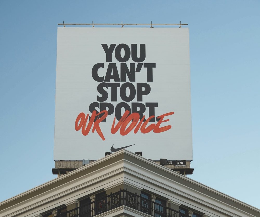
The OOH market is car-centric
The most immediate shock for European marketers is the physical size of American billboards. In Europe, outdoor advertising is designed for pedestrian environments or public transit networks. Standard formats like the UK’s 48-sheet or 6-sheet posters are built to be absorbed at walking pace. In America, urban planning centres on car ownership.
How the American OOH format is different
In America, the dominant format is the bulletin. Roughly 4.3 by 14.6 metres, these canvases are built for the interstate highway system. In line with that, the US relies overwhelmingly on car travel. Audiences spend long periods in cars in slow-moving traffic, but they also drive past billboards at full speed.
That means you have to design for both situations. A text-dense conceptual ad is off the table. However, you can make simple creative interesting enough to hold attention longer. You have roughly 1.5 to 3 seconds to capture a driver’s attention. You can do that by:
- Extensions and 3D elements: Break out of the standard rectangular grid. Adding a physical extension where part of the product image pops over the top or sides of the billboard forces the human eye to look longer because the shape breaks the brain’s expected pattern.
- Double take: Use a visual contrast. A blank, neon-coloured canvas featuring just one rendered item and a legible brand name forces the driver to pause and wonder what it is. High-contrast colour blocks pull consumers’ eyes in.
- Contextual relevance: Make the billboard speak to the physical journey. If you are advertising a sleep aid, a board that reads “Tired of driving? Rest up soon.” works because it mirrors the reality of the person looking at it, which earns engaged attention.
Less is more
With America’s high-speed viewing environment in mind, American billboard creative requires radical simplicity. European advertising often relies on clever wordplay that rewards a few seconds of contemplation. In the US, your message must be immediate and unmistakable.
The rule of seven for billboard advertising
The gold standard for an American highway billboard is the “Rule of Seven.” This rule favours fewer words and simpler creative. Your product imagery must be prominent enough to be seen by consumers speeding by, and your call to action must be easy to understand.
Also, consider legibility at a distance. High-contrast colour combinations perform best. Avoid elegant fonts that look sophisticated on a desktop but blur together when viewed from a quarter-mile away through a moving windscreen. Take into account the real conditions your audience will see the billboards at.
The OOH regulatory environment in the US
In Europe, national frameworks dictate OOH use. In the United States, the federal Highway Beautification Act of 1965 sets baseline rules for interstate highways. However, individual states and counties use their own rules to regulate OOH inventory.
Big cities like Los Angeles primarily use brightly lit digital displays and iconic billboards. Conversely, affluent suburban areas limit their height and illumination or ban digital billboards entirely. You must understand these regional legal grids before launching the campaign to avoid compliance issues.
Understanding the ad currency
When buying billboard space in Europe, metrics are provided by national bodies like Route in the UK or Mobimétrie in France.
The US equivalent is Geopath. It sets the industry standard for audience measurement, using mobile location data and traffic counts to estimate how many people had a real chance to see a given panel.
Conclusion
Succeeding in the American out-of-home market comes down to respecting how different it is. Do not shrink your European artwork and hope it travels. Design for the driver and plan around the local rules. Above all, give people one clear idea they can take in at speed. That is what gets a brand noticed in the US.

Terry Clark is the Publisher and Content Director of 365 Retail, with more than a decade of experience covering retail design, technology innovations, store openings and the wider retail industry. He also works closely with leading retailers, suppliers, agencies, events and industry awards across the UK.