Standing out in the competitive retail landscape requires more than just top-notch products; it necessitates an immaculate store presentation as well.
From the first glance to the last interaction, every detail matters. For small retailers aspiring to captivate both passersby and regular customers, the store’s aesthetic is paramount.
First Impressions Last
The facade of your retail space plays a pivotal role in capturing the attention of potential customers. Investing in a striking storefront, complete with a well-designed logo and eye-catching window displays, can draw people inside. First impressions count, and a meticulously planned exterior can speak volumes about the quality and ethos of your retail business.
The sight lines of your store also merit serious consideration. Your window display serves as a teaser for what customers can expect inside. Employ bold colours that resonate with your brand identity and make use of strategic lighting to illuminate and emphasise featured products, thereby piquing the curiosity of passersby.
A Well-Lit Welcome
A well-lit retail space is indispensable for creating an inviting atmosphere. Go for premium, energy-efficient light fixtures that disseminate a warm, even glow across your merchandise, thereby enhancing their allure. Highlighting specific products or sections with specialised lighting can also guide customers through your store.
Natural light should not be overlooked. If your location allows, make the most of large, transparent windows to flood the interior with sunshine. Sunlight can enliven your retail environment, casting your products in the best possible light and contributing to a more enjoyable shopping experience for your customers.
Entrance and Layout
The entrance serves as a threshold between the customer’s initial curiosity and their willingness to explore further. A clutter-free, spacious entryway can set a welcoming tone, making it the ideal space for displaying popular items or seasonal promotions. Simplicity and elegance should guide the design, creating a warm invitation to those who cross the doorstep.
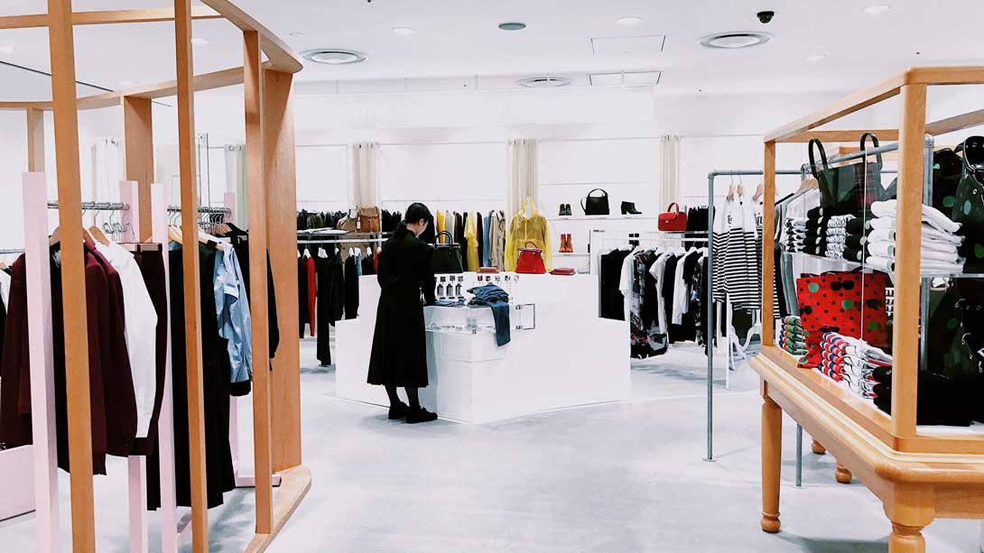
Once inside, the layout should facilitate straightforward navigation. Keep pathways clear and aisles wide enough for comfortable movement. Assign designated areas for different product categories and ensure that everything is within easy reach. A well-thought-out layout not only makes for a pleasant shopping experience but can also influence purchasing decisions by making products easy to find.
Details that Dazzle
The smallest details can significantly elevate the customer experience, creating a memorable and enjoyable visit. For example, replacing generic front door handles with solid brass door handles adds a touch of understated luxury.
Beyond the door, think about incorporating hand-crafted shelving units or artistic displays to create focal points within the store. Unique and stylish touches like these set your retail space apart from competitors, contributing to a personalised and engaging shopping environment.
Material Choices
The choice of materials for your interiors can make or break the aesthetic you aim to achieve. Organic materials such as wood and stone can lend a sense of earthy authenticity to the store, while polished metals and glass can evoke a more modern, sleek atmosphere.
Moreover, the functionality of materials is as crucial as their visual appeal. For areas that experience high traffic, consider robust, low-maintenance materials like laminate flooring or concrete. These options are both durable and easy to clean, ensuring that your store maintains its pristine appearance over time.
Colour Palette Consistency
Selecting an appropriate colour palette is critical for establishing a harmonious and brand-consistent environment. Consistency should extend from the exterior to the interior, enveloping customers in a cohesive visual experience. When selecting colours, consider the psychology behind them and how they resonate with your target audience.
Avoid the temptation to go overboard with vibrant hues. A balanced approach typically involves one or two primary colours, accented by neutral shades. This strategy ensures a cohesive look that enhances rather than distracts from the merchandise.
Signage and Typography
Effective signage and typography can substantially improve the customer experience by making navigation intuitive. Place essential signs at eye level and opt for clean, easily readable fonts. Information should be succinct but informative, allowing customers to rapidly understand product features or store layouts.
Consistency in typography is essential. Whether on price tags, promotional materials, or your online presence, maintaining uniformity in font and style aids in reinforcing your brand identity. Such meticulous attention to detail can make your retail space instantly recognisable and lend an air of professionalism and reliability.
Employee Appearance and Behaviour
Your staff represent your brand in the most direct way possible. Their appearance and demeanour should be in sync with the aesthetics and values of your retail store. A well-groomed team that adheres to a dress code aligned with your brand can significantly enhance the overall shopping experience.
Equip your staff with the necessary training to ensure they are courteous, knowledgeable, and capable of providing valuable product insights and recommendations. An empowered and informed staff not only elevates the level of customer service but can also become a key differentiator in a competitive retail landscape.
Wrapping Up
Designing a visually stunning and highly functional retail space is an intricate process that demands a keen eye for detail. From the exterior elements that draw customers in, to the interior nuances that keep them engaged, every aspect is crucial. Small retailers who invest time and thought into these components stand to gain not just footfall but also customer loyalty, cementing their position in an ever-competitive market.
