The news has been filled with doom and gloom for retail lately, with major retail chains like House of Fraser and Marks & Spencer reporting difficulty. But there’s still routes for boosting sales revenue, if you know where to look.
For example, visual merchandising has proven itself to be a major asset when it comes to the selling process. Now more than ever, visual merchandising is particularly important to battle against industry woes.
With this in mind, we have put together this guide to visual merchandising, covering everything from design to launch. A great visual marketing campaign can see your profits rise, which is invaluable in these difficult days in the sector!
What is visual merchandising?
Visual merchandising is essentially the layout of a shop floor. Everything from where the shelves should be to what products need to be on display is covered in the process. The goal is to make the store more exciting, inviting, and somewhere customers want to be! This, ideally, will lead to better profits.
But it’s not enough to just put items out where they look nice. There’s a science behind why certain presentations, structures and even colours deliver a better experience than alternative arrangements, and it’s been established that a strong visual display can raise turnover and strengthen your brand; it can even inspire customer loyalty.
Chief executive officer Bob Phibbs of retail consultancy firm The Retail Doctor, advises that: “Visual merchandising is everything a shopper sees at your store that hopefully leads to a remarkable shopping experience. It is the unspoken language retailers use to communicate with their customers.”
To avoid the difficulties that retailers such as Toys R Us and Maplin faced, you need to do everything you can to encourage the potential of visual merchandising in your business.
Of wants and needs
Global retail sales are predicted to reach $27.73 trillion by 2020, so the window for growth between now and then is certainly there. The first step to achieving effective visual merchandising is what products you will use to attract consumers. A tip here is to go for what you think your customer wants — not needs. According to a study by Raj Raghunathan and Szu-Chi Huang, emotional responses are influential in our purchasing choices — which is why you should focus on giving the customer something to desire.
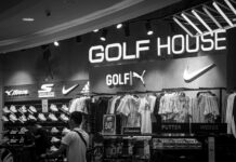
Putting the focus on newer, high-end items in focal visual merchandising displays can help to draw in customers who are seeking a luxury treat, increasing your chances of high-cost conversions. You could also use banners alongside these displays to present promotional offers for luxury items that you want the consumer to take notice of — and buy!
How to group up displays
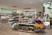
Achieving a successful grouping of products for a visual marketing strategy can be difficult. A recent report found that exposing your shopper to the maximum number of products is a tactical method when carrying out visual merchandising. However, don’t make your displays look crowded. Utilise different display furniture, such as mannequins, racks and shelves — whichever suits the product you’re merchandising — and bear in mind that focal points boost sales by a reported 229%, so ensure that you effectively direct your consumers when they enter your store.
A wise tactic would also be to use the ‘Rule of Three’, also known as the ‘Rule of Three’ for grouping up display items. The Pyramid Principle dictates that you create a triangular display, with the biggest item in the middle and the smallest on the outside — which ensures that your display doesn’t look flat and boring. Instead, it will catch the eye, as the products seem to ‘fall’ down towards the viewer. Equally effective is the Rule of Three. Within this, you create attractive asymmetry that shoppers will find engaging. Apparently, humans see asymmetry as normal — which means they pay less attention. By placing product in groups of three, you can create a noticeable imbalance that forces the eye to take in each product individually, as opposed to the display in its entirety — excellent for effectively advertising each item.
The importance of colour
Stylist and retail merchandiser, Jessica Clarke, advises that: “Things that are easy to look at will be passed over, and things that are too outlandish will be offensive to the eye.” And this goes for colour. Contrasting colours at the opposite side of the colour wheel can help grab attention — think black and white or scarlet and jade — but creating a multi-coloured display of uncoordinated colours may turn people away.
The ’decompression zone’
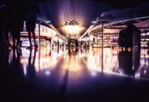
A decompression zone is another asset to keep in mind. This area of a shop is found just a few feet inside the main entrance and is believed by psychologists to elevate a shopper’s mood, acclimatise them to the store’s surroundings, and get them ready for the shopping experience.
Building an experience is vital — no one wants to shop if they feel down or unfocused. An effective decompression zone will help transport your consumer from the hustle and bustle of outside to a calmer, more focused environment that encourages browsing. Here are decompression zone tips:
- Minimum of 10-15 feet.
- Based at shop entry with a full view of store.
- Created using contrasting furnishings and colours from outside area to signal new atmosphere.
- Use mannequins, attractive stands and specialised lighting to highlight your newest ranges.
Did you know that 98% of customers turn right when entering a shop? Why not use your decompression zone to create a ‘circulation route’ from the right side that leads around your store for a smoother customer journey? Or, try placing your best products at the right of your decompression zone, if this is the most likely route consumers take.
Use all five sense
Yes, it’s visual merchandising so the focus is on appearance, but there’s no reason why you can’t support it with an experience for the other senses too. Reportedly, 75% of emotions come from smell and our mood is meant to enhance 40% when we detect pleasant aromas. If you run a fragrance, soap or food retail establishment, are you harnessing the power of smell when it comes to merchandising?
Different scents can conjure different memories or emotions for a customer. If you run a bakery and want to evoke a feeling of warmth, cosiness, and home-cooking, ensure that your customers can distinctly smell your products baking from the kitchen by setting up the area to waft aromas into the main shop. Similarly, if your brand specialises in soaps and toiletries, place these strategically around your shop floor to avoid clashing aromas. For example, put all the citrus products together to evoke a sense of energy and rejuvenation and keep these far away from lavender and camomile scents, which are more relaxing.
Change it up
No matter how stunning your shop display is, it will eventually look stale. A major part of tactical visual merchandising is moving your presentations as new stock comes in. Don’t let customers get bored of visiting you — keep changing things up and you can make it look like you’re constantly replenishing your stock and bringing in new and wonderful items (even if you’re not).
Your brand will look lazy or behind-the-times if you leave up last season’s goods or promotions, no matter how lovely they look. Change your visual merchandising displays every month and retain the perception of innovation.
It is predicted that shopping will evolve into less about purchasing and more about the experience. With visual merchandising, you can ensure that your shop offers something engaging to keep consumers interested — so why not start planning out your shop’s next visual merchandising campaign today?


